
Modura is a new eCommerce clothing brand designed for trendy men and women between 18 and 25 years old. These individuals are early in their careers and are looking for an affordable solution for business casual clothing to wear to their jobs in urban areas.
They are fashion-forward, and conscious of trends. They want to dress for the jobs they want without appearing overdressed. The client wanted A mobile app to be designed.

Here is the Sign In/Sign up screen
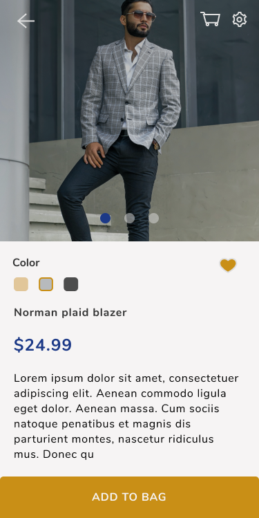
This is the screen of an individual product. I used the primary purple color to highlight important areas. Specifically the price of the item. The secondary color, a shade of yellow, is used for buttons. I believe this works well as the yellow helps bring attention to the " Add to bag" button.
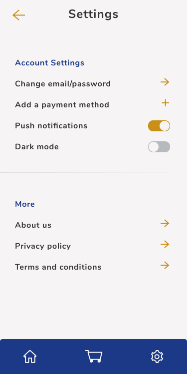
Here is this settings section of the page. I used the purple color the headings. Yellow color for the navigation arrows and the push notifications. the Purple is used for the primary icons at the bottom. This is for a sense of hierarchy for the app since purple is the main or dominating color.
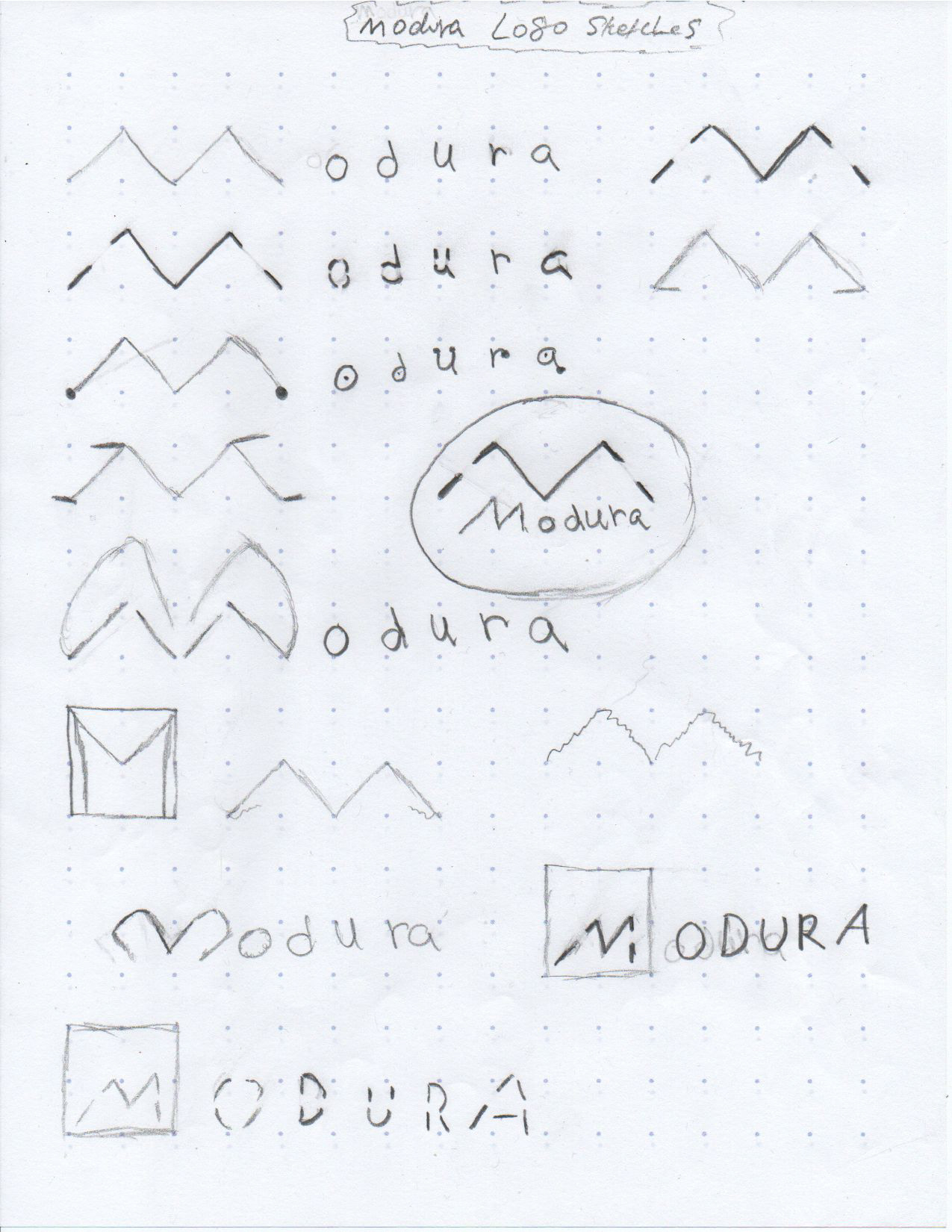
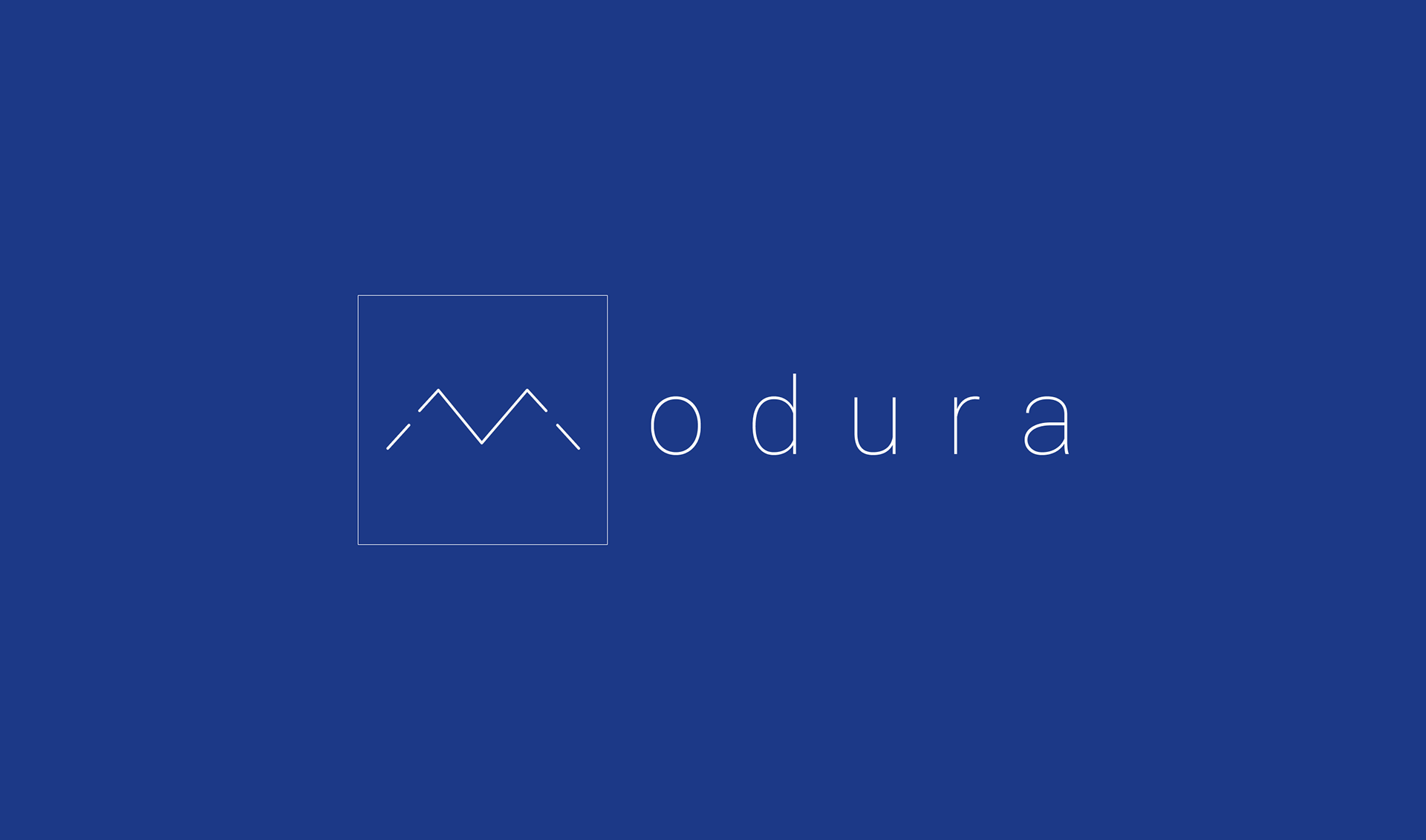
For the logo design, these were sketches I came up with with. First i added keywords from the design brief to a notepad. The keywords I used were: Trendy, clothing, affordable, Business casual, urban. I attempted to design with logo design trends in mind while also Making sure it was the right balance between simple and unique. I used Perception for most of the logos in which the lines of the letters aren't fully connected but with a glance you will perceive that they are letters.

The chosen color palette including neutral colors.
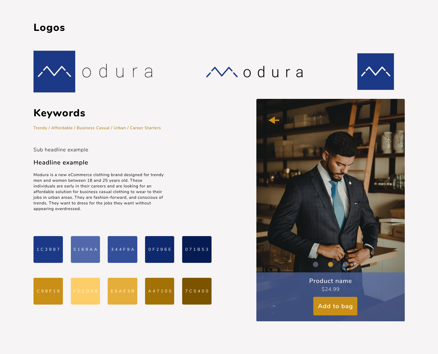
I created a style tile to help give a better idea of the different logo sizes, how the typography would be used, and how the colors would be used within the design.
And lastly, here's a prototype of the Mobile app created using Figma.