
BACKGROUND
Here is What Fiverr is about
Fiverr is a global online marketplace for freelance services. Fiverr’s platform connects freelancers (sellers) to people or businesses looking to hire (buyers). The focus on this project is to make it easier for freelancers to use the platform. Listings on Fiverr are diverse and range from "get a well-designed business card" to "help with coding". The highest-paying jobs on Fiverr include website design, social media manager, proofreading and copywriting, and resume writing. Fiverr takes its name from the $5 asking price attached to all tasks when the company was founded in 2010 in Tel Aviv. These days many sellers charge much more and are increasingly bringing their freelancers high income
What problem did I try to solve?
Now, imagine being a freelancer handling 20+ clients with multiple files shared for many different projects. After interacting with several freelancers on the fiverr forums, a frustrated designer told me of how they spent several minutes trying to find a previously shared file that a client referenced back to. This is a clear friction point in which This meant every minute spent trying to find client files was a minute lost for creating.
What was my role?
As the sole UX designer and researcher and the only person working on this project, I ventured into the fiverr forums and interacted with Fiverr users. It was during those interactions and hearing their stories that I discovered the pain points of users on both the buyer and seller side and was then able to synthesize the data which allowed me to understand the scope.
PROCESS DELIVERABLES & WHAT I DID
I had to work within critical constraints: any new file management system needed to feel like a natural extension of Fiverr's existing chat interface, not a bolt-on solution. Through competitive analysis of Upwork and Freelancer, I discovered that while other platforms faced similar challenges, measured against both user needs and platform limitations, pushing me to find creative ways to make file management feel effortless while working harmoniously with Fiverr's established systems." Different threads with clients, too much in the chat history and generally so many things on the thread would create issues finding files especially since the original upload feature only brought up a screen to choose a file from the pc, click the file, then upload. To address this, my process included (1) User interviews (2) competitor analysis (3) using the data to ideate a taskflow (4) userflow to (5) visual design of feature (6) Create test plan (7) A/B testing (8) iteration
Defining the problem
Understanding the user
Early ideation
Final solution
Next steps and learning
DEFINING THE PROBLEM
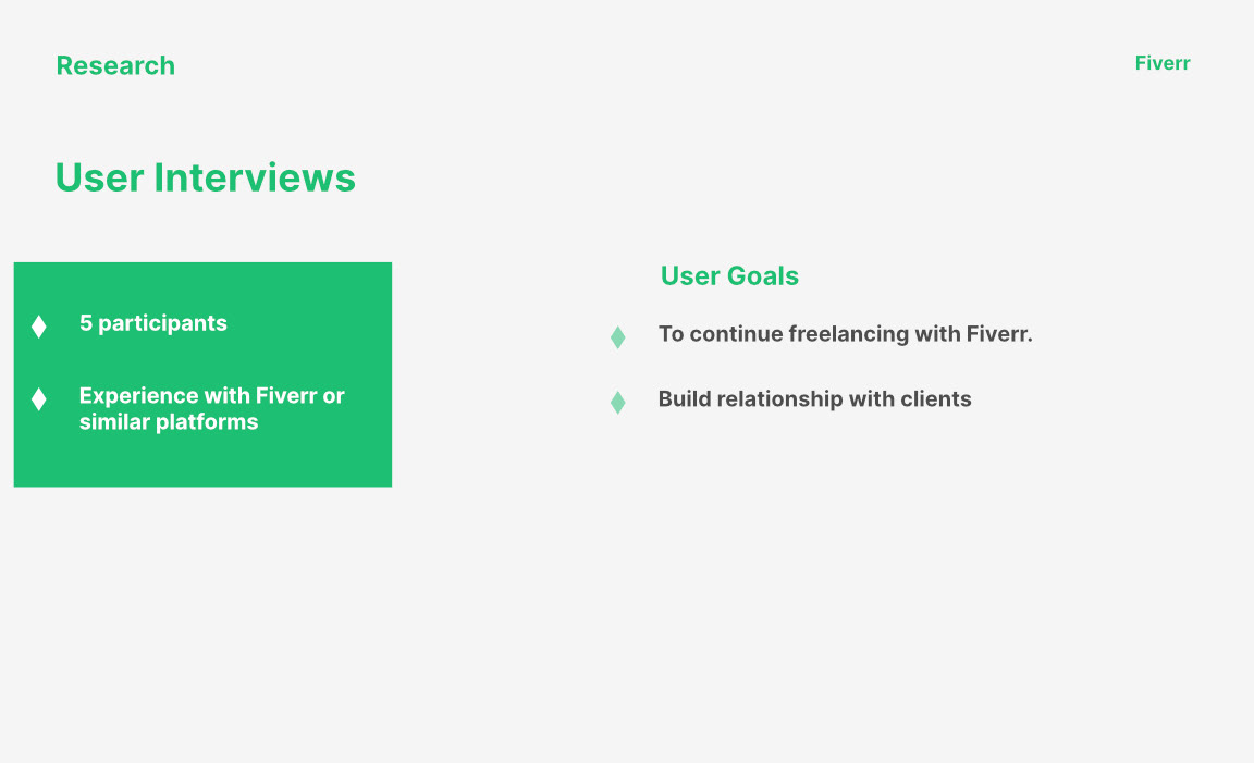
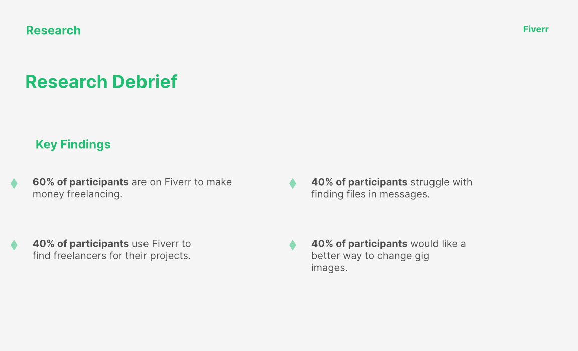
To understand the needs of freelancers, user interviews were conducted with 5 participants to get an idea of how freelancers use such platforms. see the following images below.
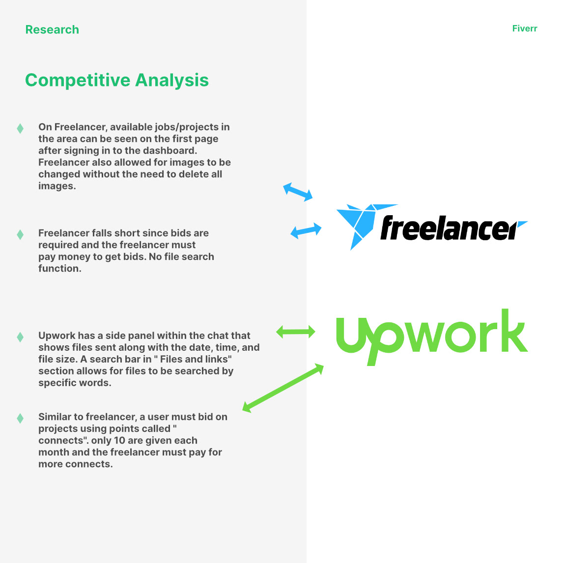
I continued the research using competitor analysis in order to find out how the competition handles file sharing and what features they offer. The following is what I discovered:
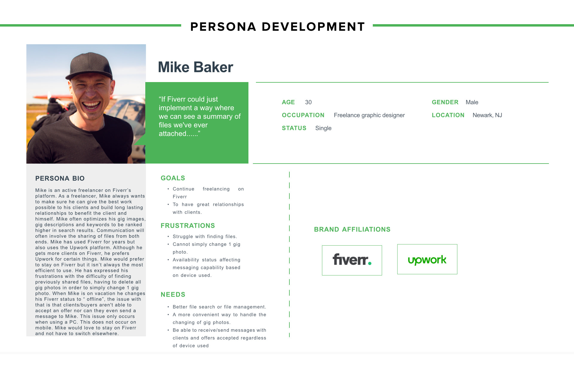
UNDERSTANDING USERS
Meet Mike, a freelance graphic designer that would like to make sure he can give his best work, build strong client relationships, and continue using the Fiverr platform.
EARLY IDEATION
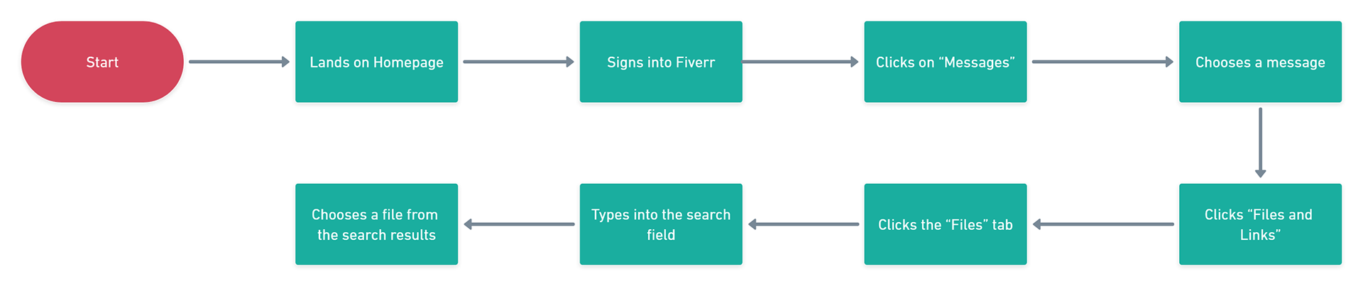
I was now able to focus on the taskflow diagram to help prepare a structure for accomplishing the task of finding and sharing a file.
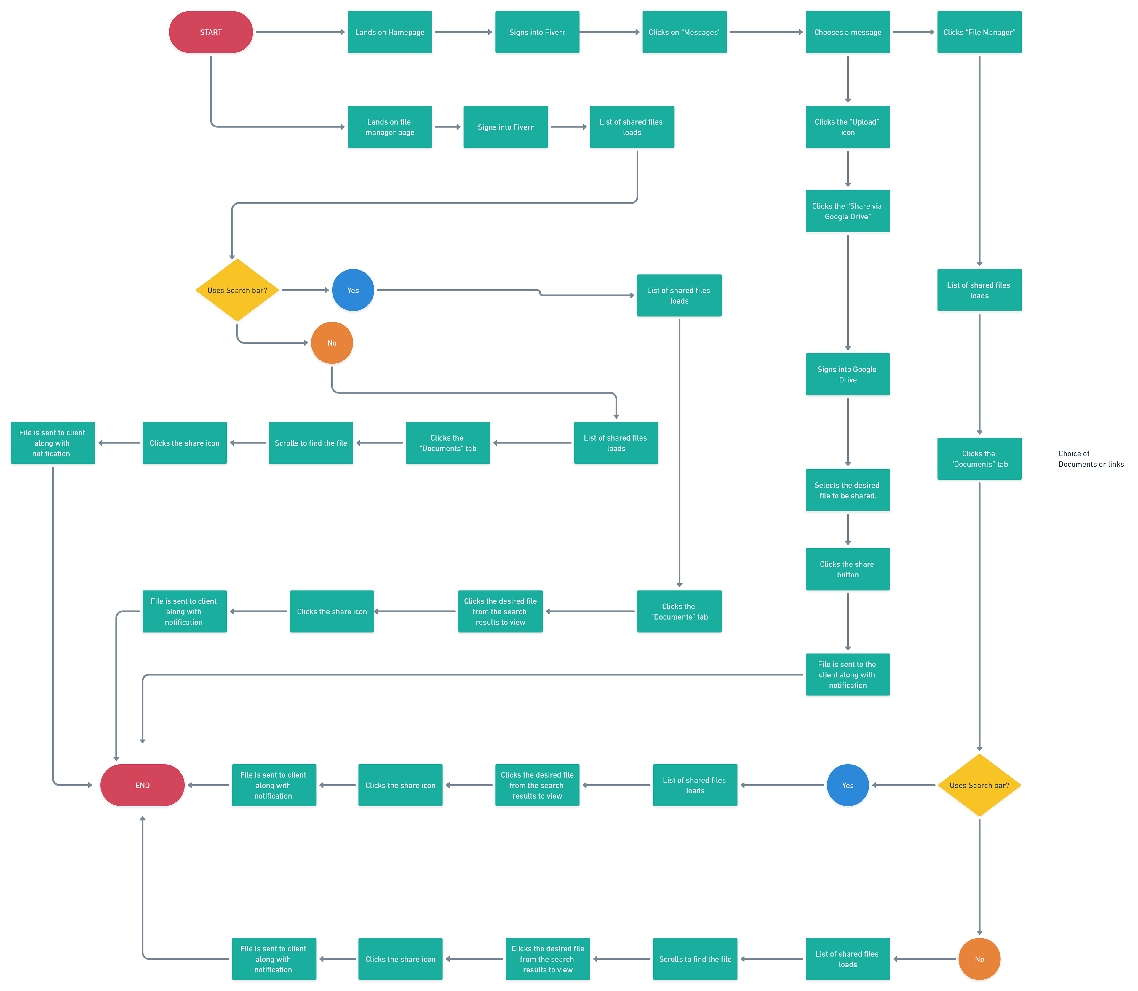
Once the taskflow was made, I created a userflow to show specific interactions and expected paths.
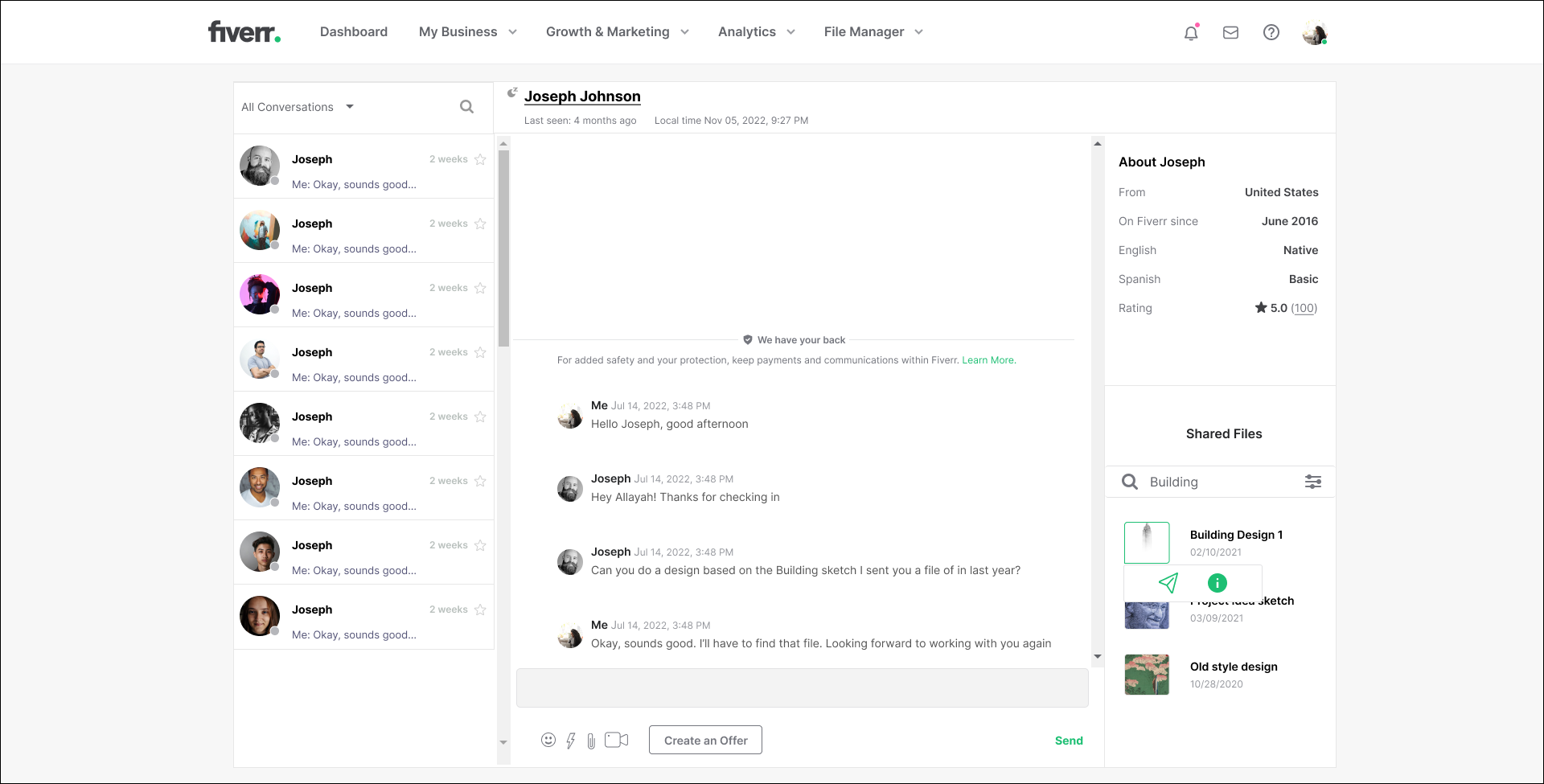
With the flows creates, I could now turn my attention to the visual design of the file sharing capability. Since I am simply implementing a feature to an already existing website, I could jump right into creating the mockups as opposed to starting with sketches and wireframes.
I started by focusing on the design for the chat section as this is where interactions would normally take place between the freelancer and the client. One of the assumptions is that including a search or filter feature would help make the file searching process easier. I decided to create two versions of the design. Version A would have no search field or filter feature and version B would include the search field and filter.
Version A
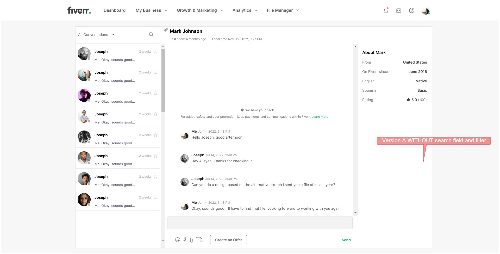
Message - Version A
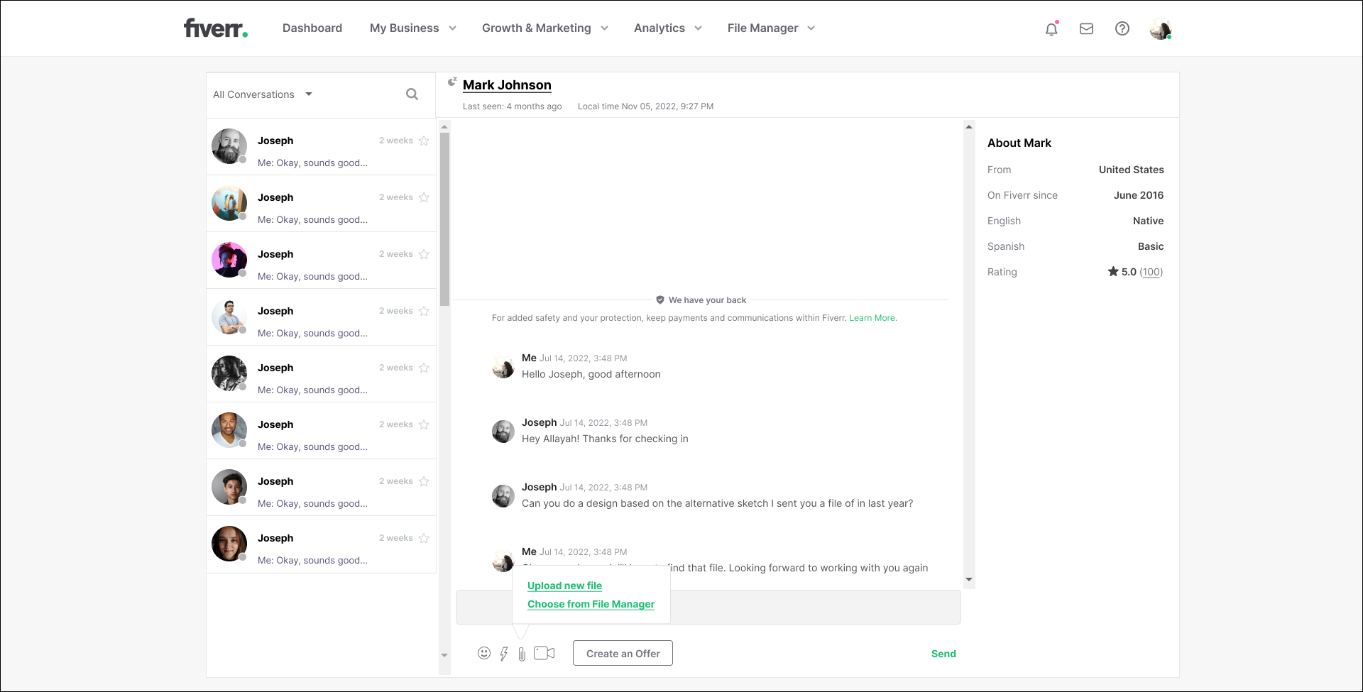
File options - Version A
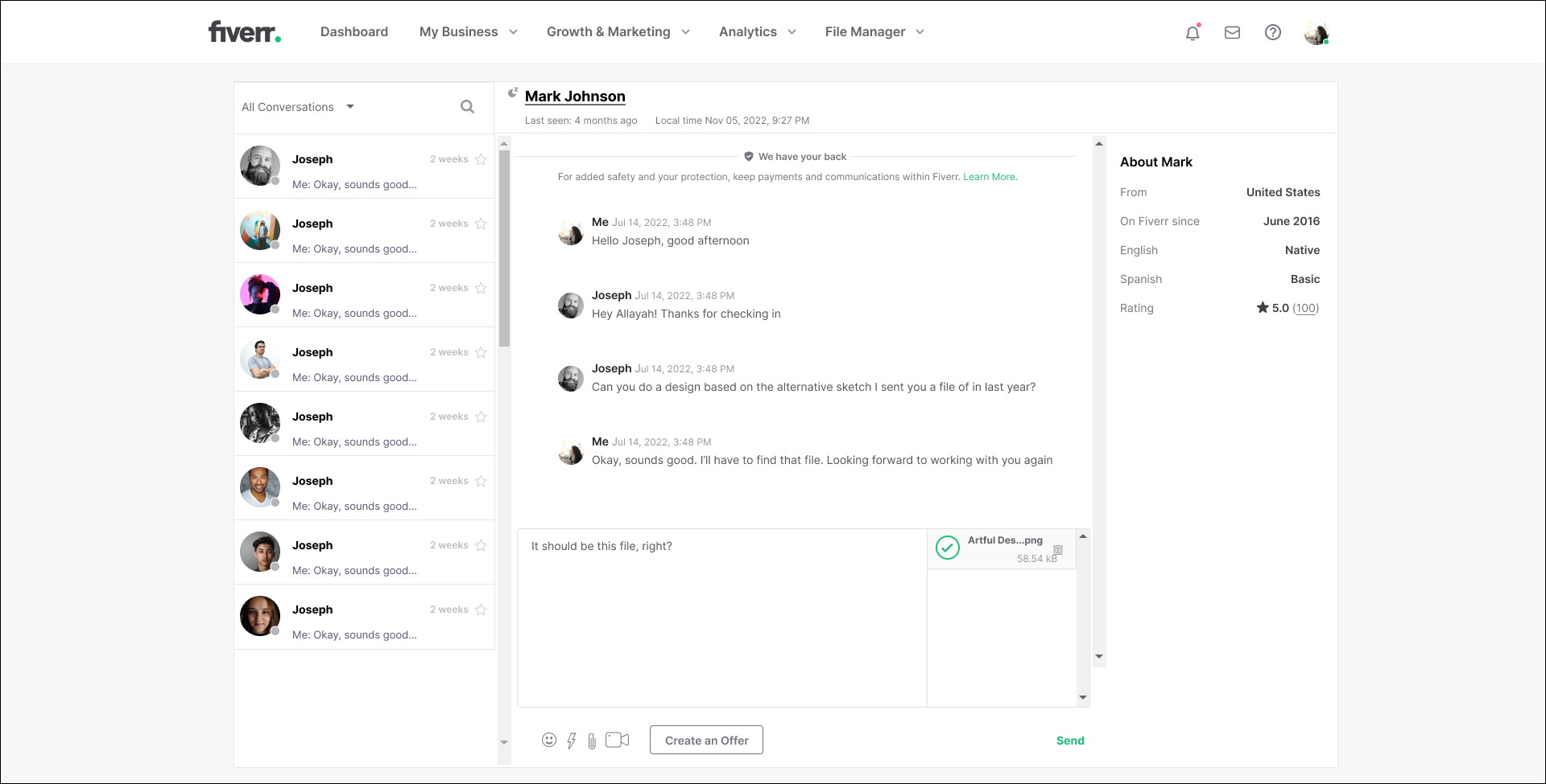
File chosen - Version A
Version B
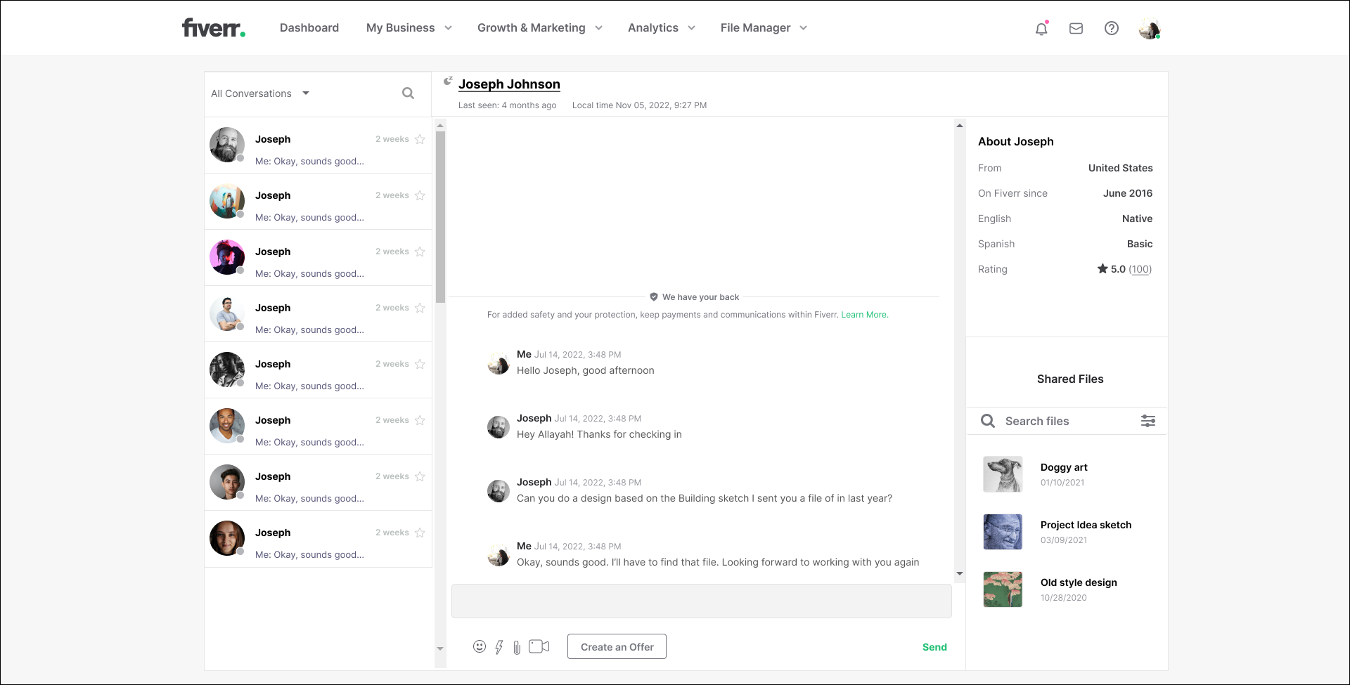
Messages - Version B
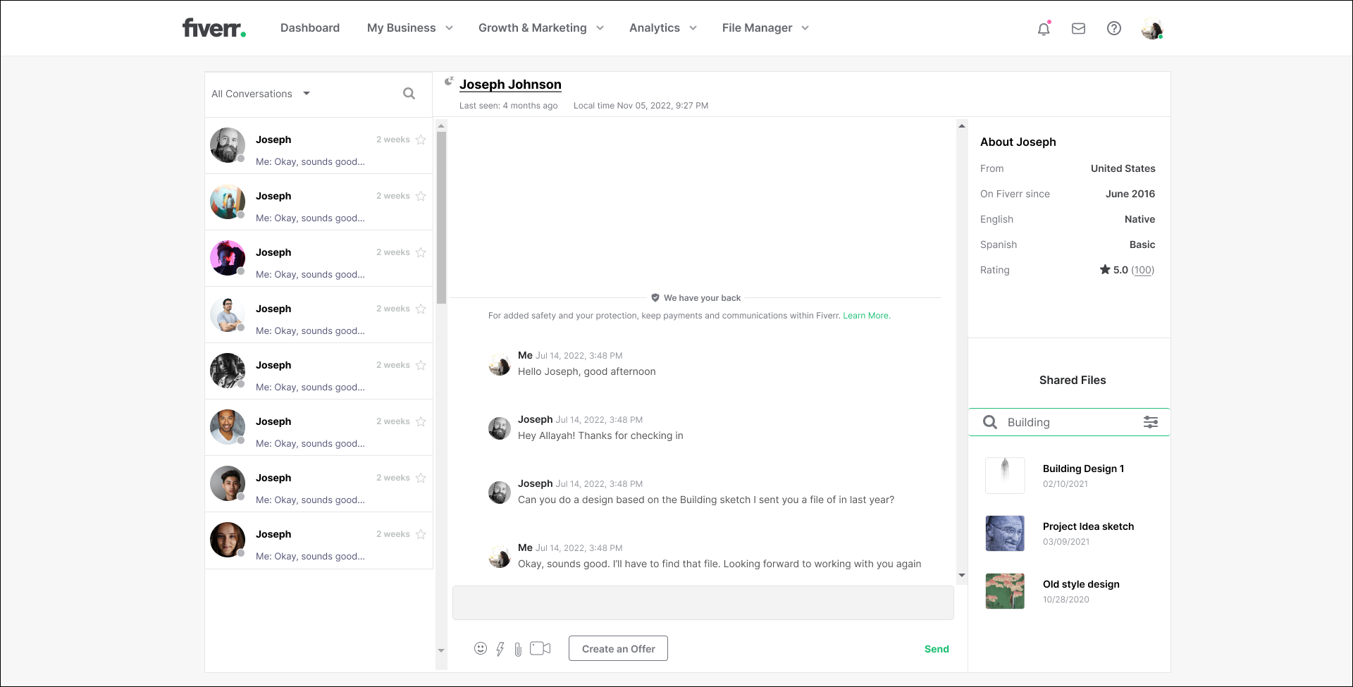
Messages B - Search bar clicked and search term entered
Messages B - File clicked
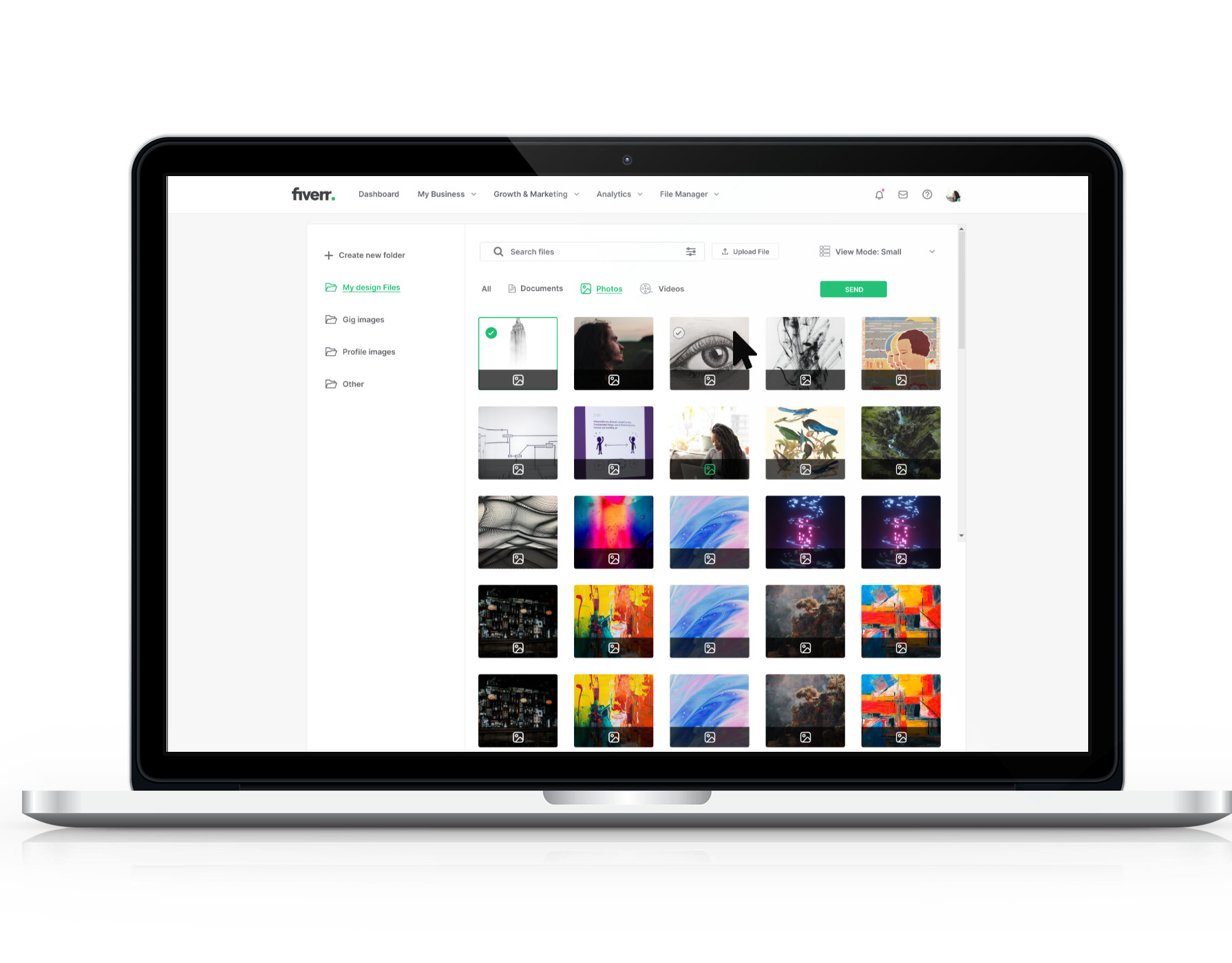
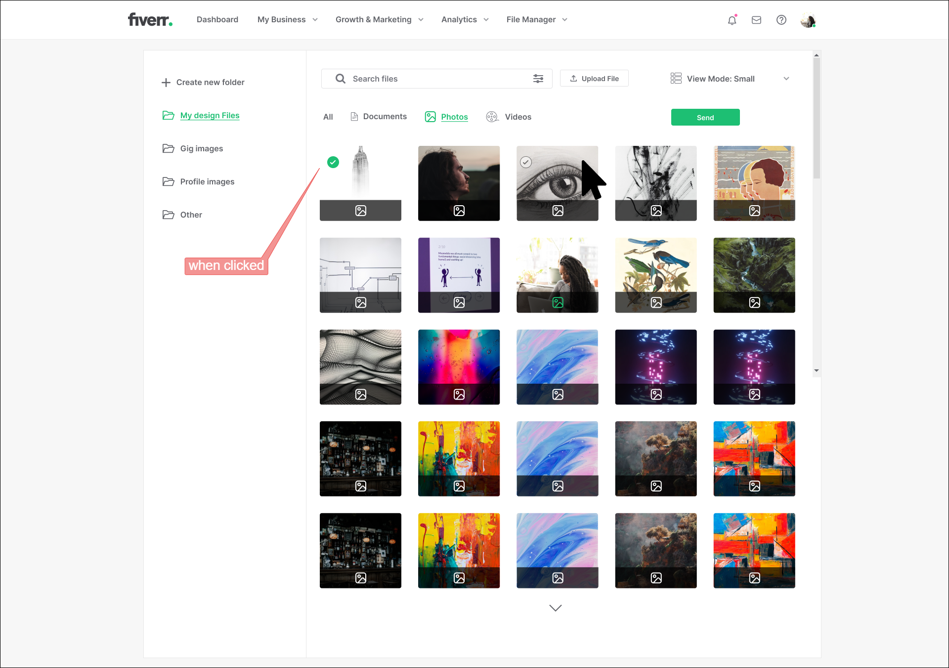
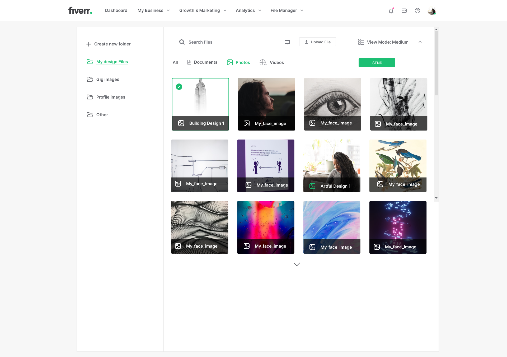
The idea for the file manager implemented is that it would be used across the entire website whether it be for profile images, gig images, etc. In the following version of the file manager shown below, hovering over the file thumbnails would reveal a gray clickable circle at the tope left of the thumbnail and once clicked the circle is clicked, it will turn green to indicate the file is selected. (See below)

File manager - thumbnail hovered over
File manager - circle clicked
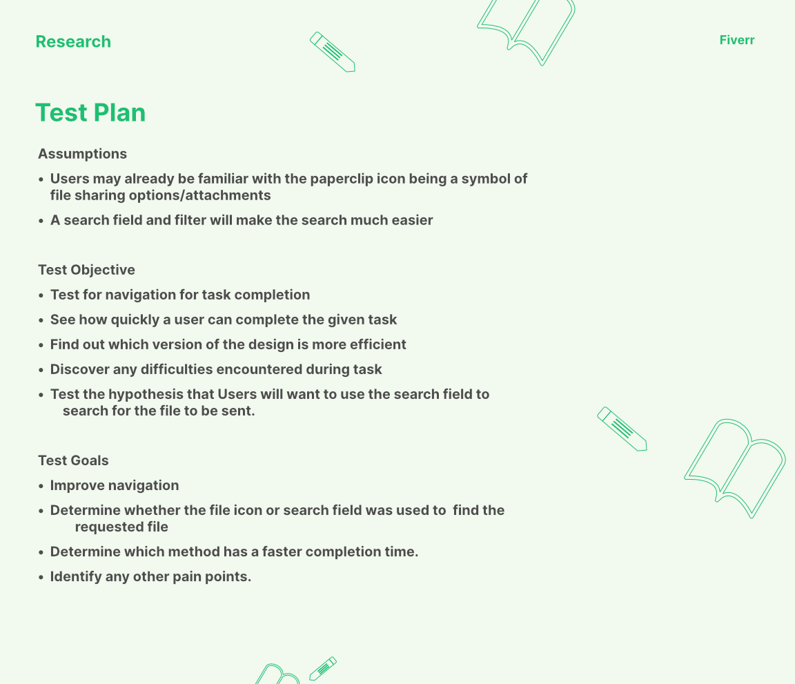
After finishing the screens, it was time to gather participants for A/B testing of both versions of the design. I wrote the following test plan:
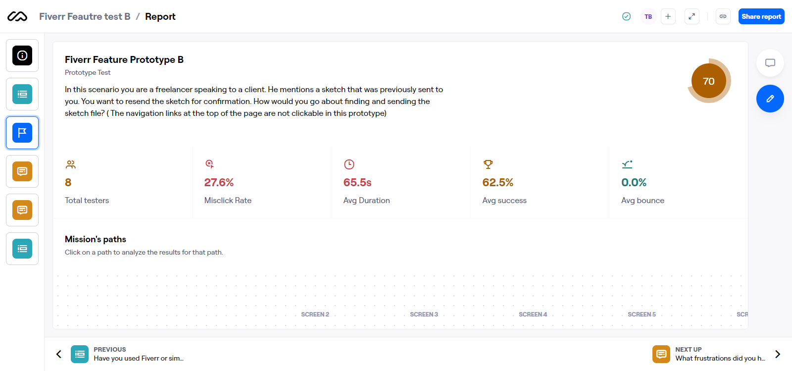
After conducting a user test with Version A, the results were not favorable. This version of the test only had one true path to completion. Based on the feedback received, long completion times and high missclick rates, Version A was not deemed a successful version of the design. The frustrations were primarily with the file selection screen in which there was no way for users to simply click a photo to select it as opposed to hovering over the thumbnail to reveal an icon that required another click. Users spend a long time on this particular screen.
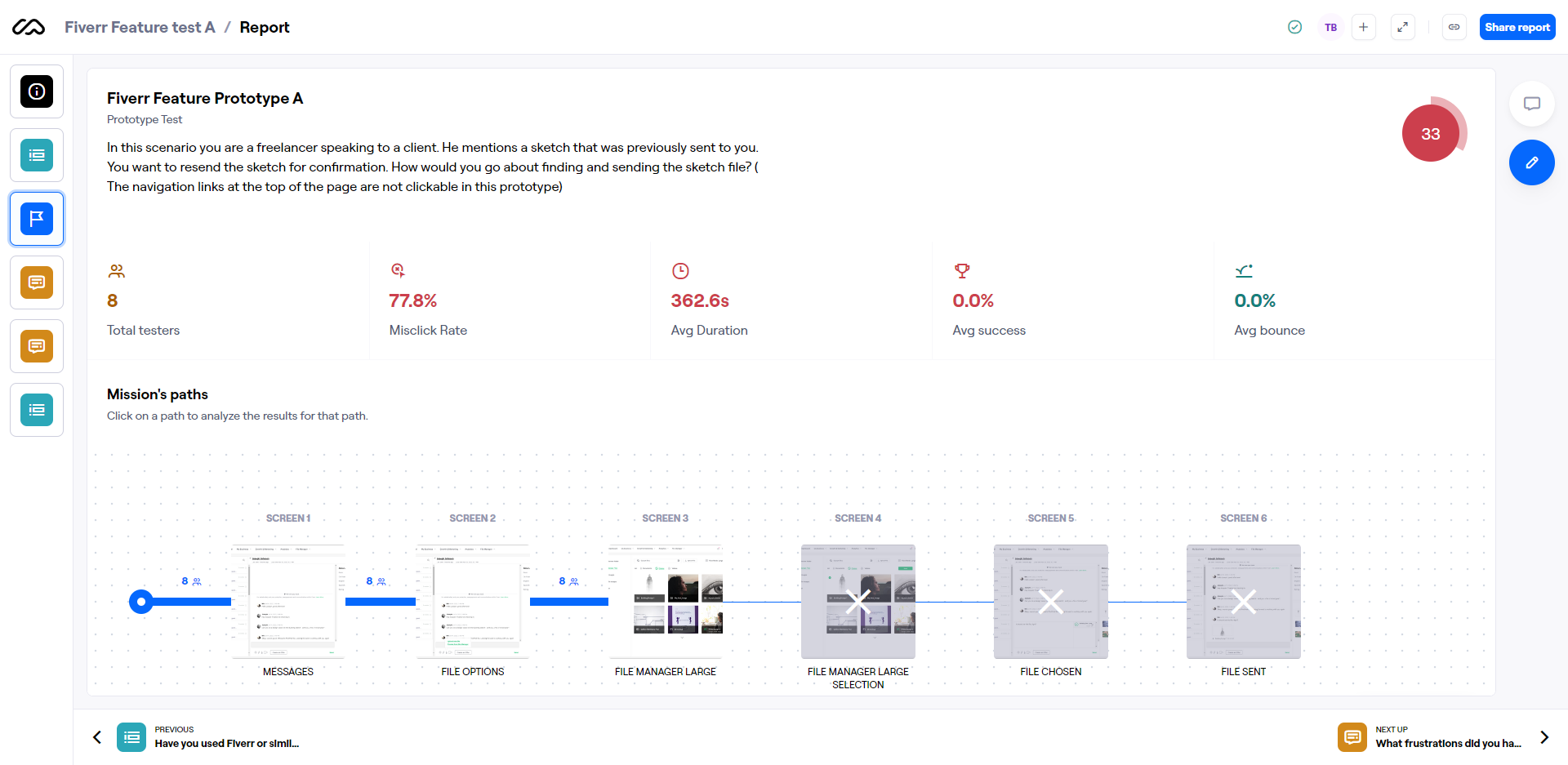
I now began to test Version B which included the following two paths:
1. Clicking the paperclip icon as in the previous version.
2. Using the search field.
Version B saw more favorable results with:
* Lower missclick rate
* Lower average duration on screens
* Usability score of 70%
From examining the data of the two paths on the message screen, 50% of participants used the paperclip icon, while the other 50% used the search field. What I noticed is that those using the search field completed the task faster than those using the paperclip. Just like in version A, Users spent a long time on the file selection screen.
The feedback received from version A and version B influenced my decisions for the next iteration. This would be used for a final round of testing. Version C, within the file manager, the user would no longer be required to click the grey circle icon. They can simply click the thumbnail directly and the grey circle will turn green while a green border will surround the thumbnail to indicate selection.
After testing was completed, I saw the following improvements:
* Misclick rate decreased from 27.6% to 4.8%
* Lower average completion time from 65.5 seconds to 23 seconds
* Higher average success rate from 62.5% to 75%
* Higher usability score from 70% to 83%
Per feedback, 88% of users felt the UI was easy to work with. Overall , version C has proven to be an improvement from the previous 2 versions on the usability aspect of the design as users were able to complete the tasks much faster and with less errors. This test was a success and version C will be the screens to stick with going forward.

LEARNING & NEXT STEPS
In the end, after testing 3 versions of the design, the feedback received was overwhelmingly positive with 88% of users finding the file manager was easy to work with. Mis click rates, average completion time, and average success rates improved and had favorable results with each iteration made. Working on this project I learned that people absolutely prefer a way to find things faster and simpler. This was evident from the results of the version that included the search field. My next step would be to find out if users had experiences with features that helped with searching for files and how they feel it helped them.